
Monday, 13 December 2010
Inventory Finished
This is the full collection of artefacts hand drawn on brown paper. Having drawn all the images before they needed rescaling and aligning onto a2. A long process but well worth it. On the full version I have included some entertaining conversations recorded at the museum and a section explaining the god that each artefact represents.

Wednesday, 8 December 2010
Type Specimen Book
For my recent brief I have created a type book for my typeface Ceramic Construct. Here is a selection of double pages spreads, including the front cover. The Book is being printed and bound tomorrow.


Wednesday, 24 November 2010
Inventory


These are part of a collection of drawings done for my latest 3 week brief. I have drawn 10 Egyptian Artefacts found during visits to the Bristol Museum. I really enjoyed employing this drawing style applying directly using a fine line. No pencils scribbles for me!

Wednesday, 10 November 2010
Ceramics

For my Communicating with Words module i was asked to design a typeface using http://fontstruct.fontshop.com/. My inspiration came from post war ceramic sets, in particular Henry Moore and Barbara Hepworth. Before jumping on the computer and designing the font using the pixel based programme it was essential to get my hands dirty! Getting hands on and creating letters in a similar style to the sculptors above gave me a wider scope into curved ceramics and was also a lot of fun. Think I will have to get the clay out more often from now on.
I have now finished this project but unfortunately am having trouble uploading imagery. For now please use these links below:
CeramicConstruct Fonstruct (This is a free downloadable font available to everyone)
Rachel Whiteread


Some of the most influential work I come across lately is the drawings of Rachel Whiteread. After visiting her exhibition at The Tate Britain I was hugely inspired with regards to my drawing approach. She has taught me to consider forgotten objects, apply considered lines and especially not to over complicate imagery. I would highly recommend the exhibition.
Lucky Strike

As part of my Communicating with Images project 'Sense of Place' I was asked to produce a 3d model on site using improvised materials. I chose to use a collection of old Lucky Strike packets that I held close to my heart. The results however Im really please with. The Brunel Swivel bridge was a great image to work from. The link to cigarettes reflects the strong input of the tobacco factory during the industrial revolution. This contributed to much of the terrace housing in the Cumberland Basin area, which were built for the workers.
Blu

You must check out the latest instalment from animation genius blu. Must of taken a lot of time to create but the results are incredible.
Saturday, 18 September 2010
Windows

As part of my warm up to university next week I was set a summer project from UWE. It simply asked to do ten sketches and ten photos looking through, or out of a window. This broad idea gave me massive oppotunity to experiment. The basis of my photos reflect my transition from country life to city, having moved to Bedminster from Banwell(small village in North Somerset). These juxtaposing themes reflect the window of oppotunity that the move has brought to me. The idea of 'window' is then brought to a completely new context when viewing the photos as a complete set of ideas.


Mike Stikey
This summer 'Art from the New World' came to Bristol's Museum to showcase some of the most amazing artists and creaters of the modern art age. In particular Mike Stikey caught my eye. He has a great way of using collected books as a canvas for his unique character designs.
.jpg)

.jpg)
Since this hes had a solo show exhibiting in the Hurly Space Gallery titled 'Reminiscent'. Stilkey depicts a melancholic cast of characters inhabiting ambiguous spaces and narratives of fantasy and fairy tales. His work is reminiscent of Weimar-era German expressionism. Using collected books as installation material is quite inspiring. Id like to try something similar!


Dave Kinsey


Calma aka Stephan Doitschinoff
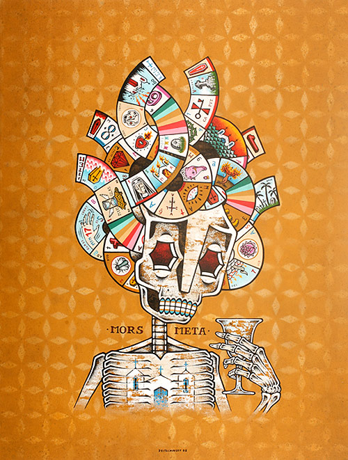
TEMPORAL (Sao Paulo)
Stumbled across South American artist recently. His style and approach is quite different to anything Iv seen. Syncretism between Christian theology and African spiritual traditions. I Adore his work.
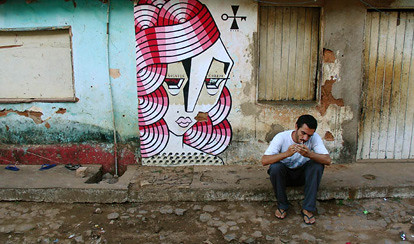
Disseminating commercial ideals

Essential marriage between formal aspects of street art and activism. While it is understood that commercial messages do not share our collective interests, we still do not question its use of our shared environments. The Toronto Street Advertising Takeover Project challenges this with striking imagery from over 60 artists within an industrial and commercial environment.
'The last supper arranged to the flatback four formation (Jesus Christ in goal)'

This weird hybrid diagram by Simon Patterson reflects how deeply implanted and trustworthy these catergories and lists have become. We are compelled to their meaning if they are meaningless.
Wednesday, 26 May 2010
Influences
This is a project for UWE that was set prior to my interview. I was asked to create 3 panels(210x210) that each reflect an influence on my design work. I chose music, my mum and Bristols incredible Street Art scene.


Music is reflected in the first panel with the manipulation of the Glade Festival logo. Unfortunatly Glade was cancelled this year making me rather upset to say the least. However its the spirit of festivals and the release and expression of music that really influences my work. I wanted the panel with my mum to be a simple phoography piece set in a peaceful traditional location. Hence the seaside where my mum spend alot of time as a child, taking influence from old photo albums. The final panel expresses what Bristol has to offer in the form of street art inpiration. It was important completely hand render this piece to in keep with the underground style of Bristol art.
The Big Apple

Last year i visited New York. During my visit I found huge inspiration in the architecture and colour compositions within the city. These photos are a small example of a collection reflecting the hustle and bustle of a city that doesnt sleep, contrasting to its more peaceful side, found in beautiful parks and stunning art galleries.


Thursday, 11 February 2010
Where Photography meets Illustration

Stumbled across this recently thanks to my friend Laurie Owens! Simply follow the link for more examples of Photography meeting Illustration. I love the contrasting imagery and medium that infact works really well in conjunction together.
Thursday, 28 January 2010
American Psyche

This is an illustration, completely hand rendered for Art Foundation last year. The aim was to make the audiece want to read about the article and catch the eye of the reader.
Wednesday, 20 January 2010
Nemean Obama

Been given another design project from local band Nemean. The upcoming gig in Febuary needs to attract a variety of people to help promote the band. Important to make the audience smile, hence the use of the obama water colour. Inspired by Shepaird Fairey's Yes we did, the quick mock up has some charming qualities, however I think something more visually striking will suit the bands image more so. When researching I was enlightened by the erray of imagery found within the genre of metal. Mastodon's artwork in particular has inspired this project and sketchbook work.
Friday, 15 January 2010
Dubaholic Magazine
Final Major Project - Art Foundation


The magazine is designed to promote local talent in Bristol and create awareness of whats worth seeing within the week ahead. Dedicated to Bristol's incredible underground scene, featuring Music, Art, Adverts, and Photography of the related areas.
This magazine is still in prototype form, still needing development in content consistancy. However I am really happy with the image, strongly linking to Bristol's graffiti scene. Highly inspired by Children of the Can by FLX.
Wednesday, 13 January 2010
MUTO
Stumbled across this insane animation. Street Art meets moving image, combining to create a visual character journey.
Winter Wonderland
The snow creates the most beautfiul setting for a photoshoot. Before any antics could begin, like snowball fights and sledging, I simply had to head out armed with my Nikon.


Monday, 11 January 2010
Nemean Promotional Poster

Currently doing promotional design work for local metal wizards Nemean. This poster was for their gig recently at the Junction, Bristol. Created using stencil, spray paint, and a little trespassing into my local quarry!
Tuesday, 5 January 2010
Stokes Croft Photography

Examples from a day spent snapping in Stokes Croft, Bristol. Home to countless street art and visual inspiration, the photos featured in my music and art magazine 'Dubaholic'.

Subscribe to:
Comments (Atom)